

7 Mistakes You’re Making with Two-Tone Walls (and How Gloucestershire Decorators Fix Them)
- Lewis Mitten
- Apr 1
- 5 min read
Is this your living room looking a bit... unfinished? Maybe you’ve seen those stunning two-tone walls on Pinterest and thought, “I can do that!” only to end up with a wobbly line that looks like it was painted during a minor earthquake.
Don't worry, you aren't alone! At Mitten’s Decorating, we’ve seen it all. Two-tone walls (often called colour capping or "half-and-half" walls) are a huge trend for 2026, especially in the beautiful period properties across Cheltenham and the Cotswolds. When done right, they add height, character, and a touch of modern flair. When done wrong? Well, they can make a room feel cramped and messy.
I’m Lewis Mitten, and today I’m sharing the seven most common mistakes homeowners make with two-tone walls and exactly how we fix them to get that professional, crisp finish every time.
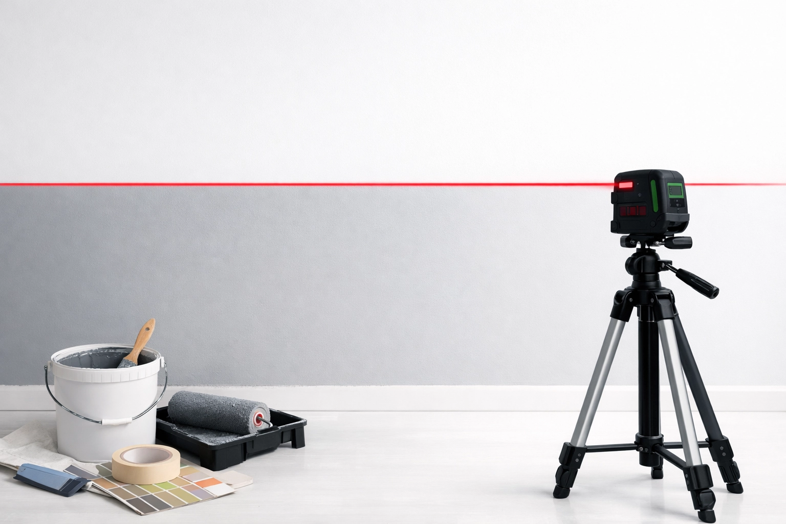
1. The "Drunk" Dividing Line
This is the number one mistake we see. You’ve got your tape out, you’ve eyeballed it, but once the paint dries, the line looks like it’s wandering uphill.
The Fix: Never, ever trust your eyes: or your floorboards! In many of the older homes we work in around Prestbury and Leckhampton, the floors and ceilings are rarely perfectly level. If you measure 120cm up from a wonky floor all the way around, your line will be wonky too.
Just a few easy steps to fix it:
Use a laser level. This is the only way to get a perfectly horizontal line across the entire room.
If you don't have a laser, use a standard spirit level and mark small dots every 30cm.
Join the dots with a chalk line or very light pencil mark before applying your tape.
2. The Great Tape Bleed
Is this your wall showing "fuzzy" edges where the colours meet? It’s heartbreaking to peel back your painter's tape only to find the paint has seeped underneath, ruining that sharp edge.
The Fix: There is a professional "secret" we use at Mitten's Decorating to ensure a razor-sharp line.
Apply your high-quality painter's tape along your level line.
The Pro Tip: Paint over the edge of the tape with the base colour (the colour that is already on the wall).
This seals the edge of the tape. If any paint bleeds under, it’s the same colour as the wall, so it stays invisible!
Once that's dry, paint your second colour over the top. When you peel the tape, the line will be perfect.
3. Ignoring the "Rule of Thirds"
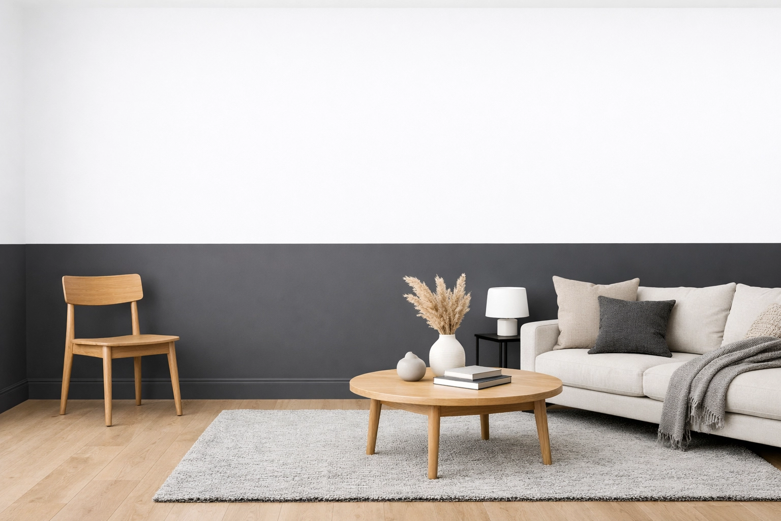
A common mistake is splitting the wall exactly in half (50/50). This often makes the ceiling feel lower and can give the room a bit of a "waiting room" vibe.
The Fix: Generally, we recommend following the "rule of thirds." Either paint the bottom third a darker colour (creating a faux dado rail effect) or paint the bottom two-thirds and keep the top third lighter to draw the eye upward. In many Charlton Kings homes with high ceilings, we even suggest "colour capping," where the wall colour continues right up onto the ceiling for a cozy, cocooning effect.
You can read more about this in our guide to 2026 decorating ideas.
4. Picking Colours in the Dark
Looks like that gorgeous navy blue looked great in the shop, but now it’s on your wall in Montpellier, it looks almost black?
The Fix: Lighting is everything. Cheltenham’s Regency homes have massive windows that let in tons of light, while some of our Cotswold cottages can be a bit darker.
Test swatches: Paint large samples on different walls and watch how the light hits them at 10 AM, 2 PM, and 8 PM.
Consider the orientation: North-facing rooms have cooler light, so you might need a "warmer" two-tone combo to keep it from feeling chilly.
5. Skipping the Scrub-down (Prep Work)
We get it: you want to get straight to the "pretty" part. But if you paint over dust, cobwebs, or old greasy fingerprints, your tape won't stick properly, and your paint might even peel later on.
The Fix: Professional interior decorating is 80% preparation.
Wash your walls with sugar soap or a mild detergent.
Fill any small cracks or holes (common in Gloucestershire's older housing stock!).
Sand those patches smooth so the two-tone transition isn't interrupted by a bump in the plaster.
6. Forgetting the Woodwork
Is this your skirting board looking a bit yellow next to your fresh new wall colour? If you’re doing a two-tone wall, you have to consider your skirting, door frames, and even coving.
The Fix: In 2026, we are seeing a massive shift toward "colour drenching" or dark woodwork. Instead of standard white gloss, why not paint your skirting boards the same colour as the bottom half of your two-tone wall? It creates a seamless, high-end look that makes the room feel much larger. Our cabinetry painting services often involve matching built-in units to these wall tones for a fully integrated design.
7. Using the Wrong Paint Finish
Using a shiny silk finish on the bottom and a flat matt on the top can look accidental rather than intentional. It can also highlight every single lump and bump on your walls.
The Fix: For a modern look, we usually recommend a "Durable Matt" or "Eggshell" finish for both sections. This gives you a consistent sheen while being tough enough to handle life in a busy Bishops Cleeve family home. If you really want to spice things up, you could even use wallpaper on the top half and paint on the bottom!
Why Choose a Professional Painter in Cheltenham?
While a DIY two-tone wall is a fun weekend project, achieving that "magazine-ready" look can be tricky. As local painters and decorators in Cheltenham, we have the tools (like those fancy laser levels) and the years of experience to handle the quirks of Gloucestershire homes. Whether it’s Victorian lath and plaster or a modern new build, we know how to make colours pop and lines stay straight.
Frequently Asked Questions (Cheltenham & Gloucestershire)
Q: Does a two-tone wall make a small room look smaller? Actually, it can do the opposite! If you paint the darker colour on the bottom and a lighter colour on top, it draws the eye upward, making the ceiling feel higher. It's a great trick for some of the smaller terrace houses in Leckhampton.
Q: Can I use two-tone walls if I have coving? Absolutely! We often suggest painting the wall up to the coving and then keeping the coving and ceiling the same lighter shade. It frames the room beautifully. If you don’t have coving but love the look, check out our coving installation service.
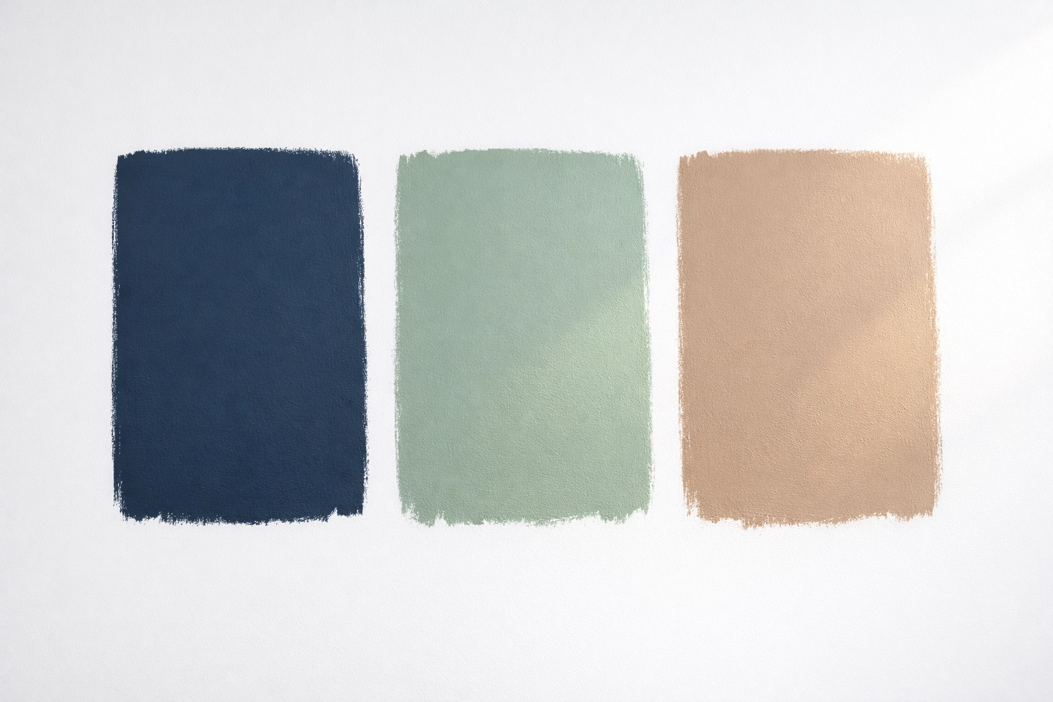
Q: What are the most popular two-tone colours in Gloucestershire right now? We are seeing a lot of "Sage Green" on the bottom with "Warm White" on top. It brings a bit of the Cotswold countryside indoors. Deep navy and soft grey are also timeless favourites for Cheltenham townhouses.
Q: How long does it take to do a two-tone room? For a professional team, usually 1-2 days including prep and drying time. For a DIYer, we recommend setting aside a full weekend to ensure you don’t rush the tape-sealing step!
Need more help?
If you're ready to transform your home but the thought of a spirit level and rolls of tape fills you with dread, we are here to help. From exterior decorating to intricate interior work, Mitten's Decorating covers all areas across Gloucestershire.
Check out our blog for more tips, or contact us today for a free, friendly quote. Let’s make your walls something to talk about!
Meta Description: Stop making these 7 common two-tone wall mistakes! Lewis Mitten from Mitten's Decorating shares pro tips for perfect lines and colour capping in Cheltenham homes.
Comments